
Because of this, it seems that most businesses tend not to make use of promotional stickers in their marketing efforts; this is a huge shame, as stickers have such a huge amount of potential, especially when it comes to getting the word out about your brand.
However, for a sticker to be able to make such an impact, it needs to be well designed, beautiful, and most importantly, it must appeal to your target demographic. But the question is: what makes a beautiful sticker design?
We sifted through countless promotional stickers online – some good, some bad – looking for the answer, and decided to round up a list attributes that we felt were responsible for making the beautiful ones, well, beautiful.
Here are a few tips for Beautiful Sticker Design:
#1 – Keep it Colourful
"> Source
Typically, you want your sticker to be seen my as many people as possible and ideally, from as far away as possible too.
The reason for this is simple: the more people that see your sticker, the more brand awareness you’re going to build.
Perhaps the simplest way to do this is by making wise use of colour, and in particular, bright colours.
Bright colours will stand out much more than dull colours (obviously), especially from a distance. So, even if your brand isn’t generally the most colourful of brands, or if you don’t typically use bright colours across most of your companies branding, it might be worth considering doing so when designing your stickers.

Source
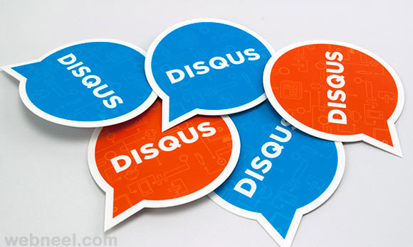
For example, you can see from the screenshot of their website (above) that Disqus isn’t the most colourful of brands.
Sure, they utilise red and blue in small quantities on their website, but the predominant colour of the website (and the Disqus commenting platform that is embedded on websites/blogs) is white.
However, when they created promotional stickers to increase brand awareness, you can see from the image above that they opted to use bright blue and red as the two primary colours for the stickers.
Why? Because they’re going to command more attention than white, especially from a distance.
If your brand isn’t particularly colourful like the Disqus brand, you can use the same trick. Simply take any existing brand colours and use them in abundance on your stickers. If your existing brand colours happen to be quite dull, use slightly more colourful versions of the same colours; it’ll keep things on brand, while increasing the visibility of your stickers.
#2 – Keep it (Really) Simple

Source
As most stickers tend to be quite small in size, you typically don’t have much space to work with when creating your design.
Because of this, you need to keep things really simple; otherwise you’ll just confuse people with a cluttered design, and your sticker won’t create the intended impact.
The “I [camera] New York” stickers (pictured above) offer a great example of how simplicity can work in your favour. These stickers are nothing more than a play on the “I <3 New York” branding and are exceptionally simplistic.
However, it’s this simplicity that makes the stickers so eye-catching. There are no unnecessary photos/illustrations of the Empire State Building or Statue of Liberty to detract from the message; they’re just simple and to the point, the way stickers should be.

Source
These Envato stickers are another great example of how simplicity can work well.
Envato run a number of websites that sell website themes, graphic design templates, code snippets, and so forth, but you’d never guess from the sticker design itself (at least not unless you were aware of Envato in the first place).
However, the simplicity actually works in their favour, as the absence of information leads to a sense of curiosity (i.e. “what is that weird green and black sticker all about?”), and gets a person talking about their brand.
#3 – Keep Text to a Minimum

Source
Following on from the previous point regarding simplicity, it’s also important to keep text to a minimum when designing your stickers.
While copious amounts of text might be necessary when creating a leaflet, flyer, or brochure, the aim of a sticker is to capture people’s attention and build brand awareness, not explain the ins and outs of your brand/product/service.
Therefore, your sticker should include the minimum amount of text necessary to get the message across.
In some cases, this might even be no text at all.
If you take a look at the sticker above – for Linux – you’ll see that nothing, apart from the brand logo, is used. There’s no brand name, no slogan, nothing.
The reason for this is simple: the target demographic for Linux will already likely be aware of what that icon represents; they don’t need any text to explain it to them.
Plus, these stickers are likely to be used predominantly by those familiar with Linux who wish to “fly the flag” for the operating system, and let their friends know that they’re part of the Linux club, so to speak.

Source
In other cases, a little more text might be needed, as demonstrated by these stickers for the International Start-up Festival.
You can see that the stickers not only give the name of the event, but also the date on which it will take place.
This allows people to get a general sense of what event is all about (i.e. start-ups), and whether or not they’re likely to be able to attend, within seconds of glancing at the sticker.
Remember, the stickers job isn’t to give people all of the information about a product/service/brand/event, but to simply introduce them to it. So, if a person see’s the sticker, likes the sound of the event, and also believes they may be able to attend, he/she can simply look-up more information online.
#4 – Keep Placement Locations in Mind
Although this differs from business to business (depending on the nature of your product service and your target demographic), there are likely to be certain places that your stickers are most likely to end up.
If you take the Linux stickers featured in the previous point, for example, chances are that they will end up being stuck to peoples’ computers, laptops, laptop cases, and so forth.
Most computers and laptops are similar colours: black, grey, or possibly white.
You’ll notice that no matter which one of these colours the persons computer happens to be, the sticker will always stand out, mainly due to the contrasting yellow colour.
Source
If you take a look at the stickers above – which are also for a particular version of Linux – you’ll notice that when placed on a black, grey or white computer/laptop case, the design would be much more likely to blend-in and therefore, wouldn’t create much of an impact.
This is because there would be very little contrast between the colour of the stickers and the colour of the computer case.
So, you can see why it might make sense to keep in mind the placement location(s) of your stickers during the design process, as by doing so, you can design the stickers for maximum contrast.

Source
Here is another example of this concept in action, this time for a consultancy company.
You can see from the example above that these stickers tended to end up in random outdoor locations in urban areas (i.e. cities).
You’ll notice that the colour green is typically in short supply in such locations and therefore, green was the perfect colour to choose for these stickers, as it ensures that they stand out from their surroundings.
#5 – Keep it “On Brand”

Source
Following the tips laid out above will all be in vein if you don’t also make sure to keep your sticker “on brand”.
While some stickers are created for purposes other than brand awareness, it still pays to ensure consistency between all branded marketing materials, and that includes stickers.
If you fail to keep your sticker on brand, you’ll fail before you even begin, as there’s virtually zero chance of building up any brand awareness for your company.
So, to keep things on brand, make sure to follow the same colour scheme as the rest of your marketing materials (at least roughly, although using slightly brighter variations of your brand colours can often work well), use the same typography, the same personality, and so forth.

Source
Here’s a great example from The Toy Store (above).
Notice the consistency between all of their branded products including envelopes, letterheads, business cards, and stickers.
The stickers utilise the same colour scheme and typography as the rest of the branded products, and vice-versa. They’re also colourful, eye-catching, simple (i.e. not loaded with information), and keep text to a minimum.
Conclusion
By following the tips laid out above, you should be well on your way to creating a beautiful sticker design on behalf of your company (or client).
While the rules aren’t set in stone – you may certainly struggle to create a design that fulfils all of the criteria – the tips are a great starting point for just about every sticker design project.
Remember that 99% of the time, the job of your sticker is to create brand awareness; so sticking to point #5 is especially important.


0 comments:
Post a Comment